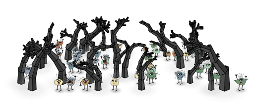
Stumbled across a wonderful website yesterday with a lot of awseome and open source Flash applications that produce wonderful graphics, many of them fractal, complex. [http://levitated.net/ Check out Levitated.net]—a friendly company.

Stumbled across a wonderful website yesterday with a lot of awseome and open source Flash applications that produce wonderful graphics, many of them fractal, complex. [http://levitated.net/ Check out Levitated.net]—a friendly company.

While working on a new stylesheet (CSS) for my web presence, and being a zealot when it comes to a baseline grid snapping all text, I found this wonderful article on [http://www.alistapart.com/articles/settingtypeontheweb Setting Type on the Web to a Baseline Grid] by Wislon Miner. Thanks Wilson.
Browsing [http://net-savvy.com/executive/tools/visual-text-analysis.html visual text analysis] led me to [http://eagereyes.org/blog/visualization-sets-information-free.html Visualizations Sets Information Free] which in turn made me stumble over [http://scriptcloud.screenplayanalytics.com/ ScriptCloud] lets you create content clouds (like a ”’tag cloud”’) from your screenplay.
[http://scriptcloud.screenplayanalytics.com/  ] If a tag cloud means nothing to you, [http://scriptcloud.screenplayanalytics.com/faq.php check out the FAQs] to find out more. Scriptcloud is intended for screenplays but you can upload any kind of text file.
And so I did. Picked my CV, saved as plain text and fed it ti Scriptcloud. The result is obvious. Too bad you can’t click on the tags.
[http://tagcrowd.com/ TagCrowd] is another interesting similar tool.
Want this to work at (subsets of) my wiki or forum; and select my own font; and set the rectangular area to render it in; and have it as a plug-in or extension to any CMS.

The Math of Text Readability: “An anonymous reader writes ‘Wired magazine has an article that explains The Law of Optical Volumes, a formula for spacing the letters on a printed page that results in maximum readability. Wired’s new logo (did anyone notice?) obeys the law. Unfortunately, Web fonts don’t allow custom kerning pairs, so you can’t work the same magic online as in print. Could this be why some people still prefer newspapers and magazines to the Web?
From Underwire‘s article “Law of Optical Volumes: The Math Behind Wired’s New Logo“:
:”’The same goes for Wired’s new logo”’. It alternates between letters without and with serifs, yet the area between each pair of letters is about the same, thanks to the serifs on the I and E and lack thereof on the W, R and D. This equivalence makes the logo easier to see and read across a crowded supermarket aisle. The alternating fonts also make the letters seem to blink on and off as you read them from left to right, in emulation of digital ones and zeroes.
The story also refers to typography guru Jonathan Hoefler. You can see Hoefler’s work at typography.com.
Read more of this story at Slashdot.
(Via Slashdot.)
While on the topic of fonts, the [http://www.lucasfonts.com/lucasfnt/sun/sun-.html Sun font] is my standard and favorite, as you can [http://aardrock.com see on AardRock’s home page]. The Sun font is designed by [http://www.lucasfonts.com/ Lucas de Groot] from [http://www.fontfabrik.com/ FontFabrik]. Even [http://en.wikipedia.org/wiki/Lucas_de_Groot Wikipedia has a page on Lucas de Groot].
I’ve got something with fonts. Especially sans fonts. A couple of months ago, I got a small booklet handed out by Premsela titled “[http://www.morf.nl/inhoud/morf_nr4/artikelen/index/-/nl Morf 4]”. Martin Majoor writes about the correct use of typography in is article [http://www.morf.nl/inhoud/morf_nr4/artikelen/04_06_majoor/-/en Did the French king have shoe size 49?]. Nice and clean piece of work on emdashes, endashes, single qoutes and apostrophes among other things.
Can’t find a home page on Majoor or any other good source to contact him. Any help is appreciated.